So I'm a little late.... I just couldn't come up with anything neat for my Tuesday post. So I spent several hours Tuesday night surfing the internet in hopes of finding inspiration. I saw a technique I liked at Splitcoast Stampers -- an acrylic distress by Beate Johns, which you can find HERE. But instead of cardstock, acrylic paint, and dye ink, I used a Diet Coke with Lime can (my personal beverage of choice) and alcohol inks.

To get a can apart, stab a pair of sturdy scissors in near the top of the can and cut all the way around. Then cut straight down the side and around the bottom. I've never drawn blood with a Coke can, and I'm pretty accident prone (I once managed to swing a hammer into my own forehead!), but I still feel the need to say that the edges are sharp so be careful.
Place the flat-ish can (it's still going to curl) in an embossing folder and run it through your die cut/embossing machine.

For the pictures I used a paisley embossing folder. But then when I couldn't decide what to do with it, I used the SU! Flower Garden folder for my card. Embossing leaves a few small wrinkles in the aluminum, but I don't think they hurt the look at all.

Now get out your alcohol inks and the little applicator and pad and go to town. You might want to use a little alcohol blending solution, too. Just put a few drops of whatever colors you want on the pad, add a drop or two of the blending solution, and thoroughly cover the entire piece of aluminum.

I used Wild Plum, Stream, and Stonewashed. These are alcohol based inks (makes sense, right?) so any spills or smudges clean up fairly well with rubbing alcohol or even an antibacterial wipe. Love those things!

Now to bring out the design, just lightly sand across the surface. I accidentally sanded the color off some of the wrinkles, but was able to dab a little more ink over them. The pad stays wet longer than you'd think.

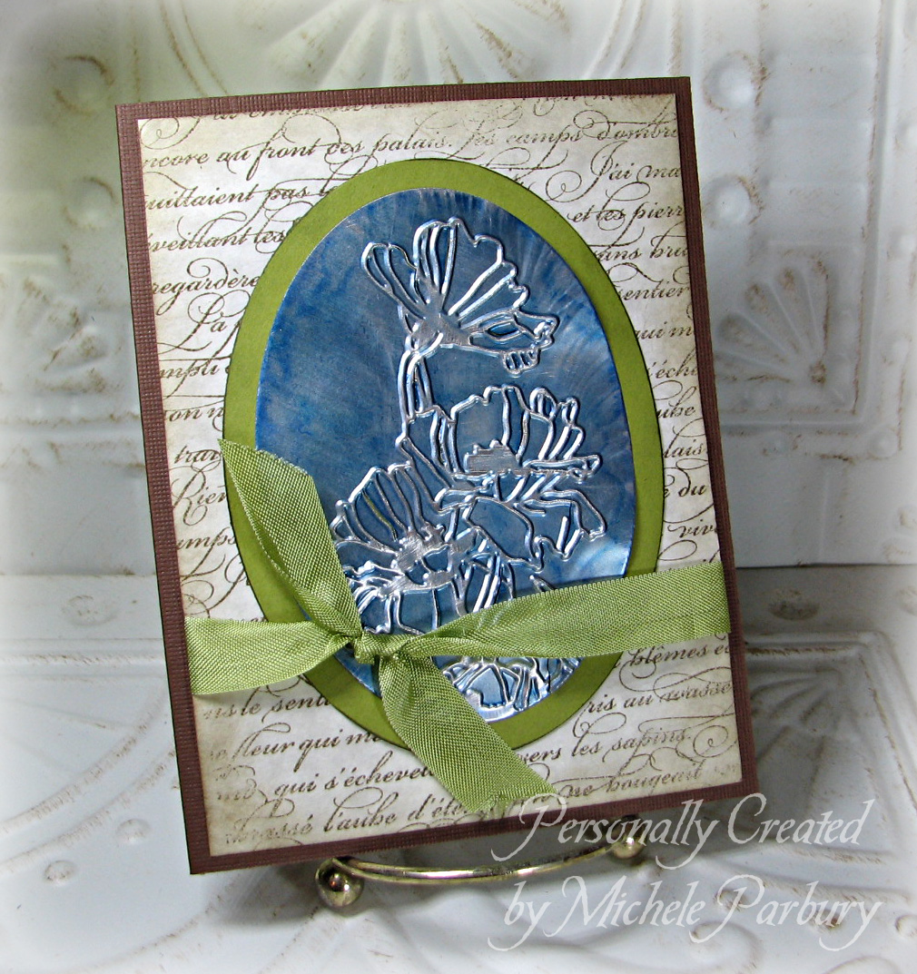
After embossing this piece, I used Nestie ovals to cut the aluminum and the green cardstock matt. Then I used the two shades of blue ink--Stream and Stonewashed--to color the aluminum. The background is SU! En Francais in Soft Suede and everything is tied together with Pear Pizzazz seam binding ribbon and adhered to a dark brown card. You can see the wrinkles even more at this angle (at the top right edge of the oval), but again, I don't think they take away from the look at all.
Did you notice the watermark on this pic is different? I MADE the new font on my iPad! How cool is that?! That is pretty close to what my actual handwriting would look like if I took the time to write v-e-r-y s-l-o-w-l-y a-n-d c-a-r-e-f-u-l-l-y. Like that's ever gonna happen!
Soooo.... What would you suggest for the purple paisley pop can? When I figure something out I'll sneak it in with another post. Now I'm wondering how something like this would work with colored Sharpies. They're alcohol based, too, after all. I wonder if the blending solution would work with them....
Thanks for stopping by! See you Friday!
No comments:
Post a Comment